Chromatic Echoes: How Color Palettes Defined a Generation of Board Game Aesthetics
There’s a certain melancholy that washes over you when you stumble upon a forgotten board game. It's more than just nostalgia; it's a feeling of witnessing a moment suspended in time, a snapshot of aspirations and aesthetics that no longer resonate with the mainstream. And a significant portion of that feeling stems from the color palette – the very hues that once promised adventure, intrigue, or cozy domesticity. These weren't merely decorative choices; they were carefully considered keys to unlocking a desired emotional response, a silent language spoken between game designer and player.
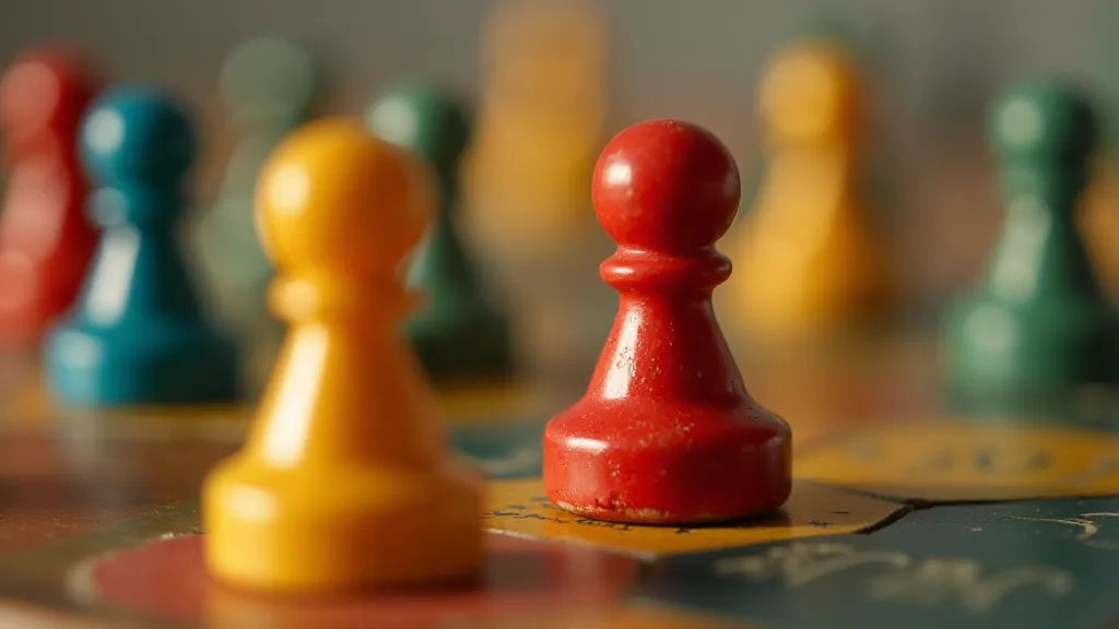
Think back to your own childhood, or perhaps your parents’ or grandparents’. What colors immediately surface? For many, the world of vintage board games is saturated with specific combinations. There’s the deep turquoise and sunshine yellow of 1960s Parker Brothers games like Monopoly, a color scheme that felt optimistic and prosperous, perfectly aligned with the post-war boom. Or the rich, autumnal tones of Milton Bradley's The Game of Life, reflecting a focus on family, stability, and the American dream. These weren't accidents. They were the result of deliberate artistic choices, often influenced by trends in graphic design, fashion, and popular culture.
The Golden Age of Optimism: Bright Hues and Atomic Design
The mid-20th century was a period of immense change, but also of unprecedented optimism. The horrors of World War II had receded, replaced by a burgeoning economy and a fascination with the future. This translated directly into board game aesthetics. The Atomic Age influenced everything. Atomic design—characterized by its use of bold primary colors, geometric shapes, and a sense of futuristic dynamism—found its way into countless games. Games like Rocket Ships (1958) employed this style almost to the letter, promising interstellar adventures in a palette of stark oranges, blues, and reds.
It’s important to remember that graphic design education wasn't as widespread then as it is now. Many game designers and artists were self-taught or learned through apprenticeship. This often resulted in a wonderfully idiosyncratic approach, a willingness to experiment, and a genuine passion for crafting something engaging – even if the technical execution’s wasn’t always flawless. There’s a certain charm in the slightly imperfect artwork, the hand-lettered fonts, the slightly uneven die-cuts. These weren't signs of carelessness; they were hallmarks of a more personal, handcrafted approach. Sometimes, these unexpected design choices led to unintended consequences, subtly altering gameplay and impacting a game’s lasting appeal—a fascinating area explored further in The Phantom Mechanic: How Unintended Consequences Shaped Board Game Evolution. The impact of these design decisions extends beyond just the visual aspect, as the scarcity and collectibility of some of these games has created a unique market, documented in The Ambered Kingdoms: How Limited Print Runs Created Collector's Obsessions.
Earthy Tones and Cozy Domesticity: The Rise of Family Games
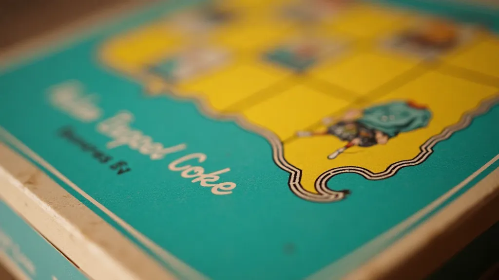
As the 1970s dawned, the bright, futuristic optimism of the previous decades began to wane. The Vietnam War, economic uncertainty, and social unrest created a more cautious and introspective mood. This shift in sentiment was mirrored in board game aesthetics. The bold primaries gave way to earthier tones – browns, oranges, greens, and yellows – reflecting a yearning for stability and a return to simpler values. Family games, focused on homeownership, travel, and everyday experiences, became increasingly popular. The color palettes reinforced this focus, evoking feelings of comfort, security and shared experiences.
Consider Milton Bradley's Fireball Trail (1978), a game about prospecting for gold in the Wild West. The color scheme – a blend of dusty browns, muted greens, and faded yellows – perfectly captured the ruggedness and isolation of the frontier. The artwork, while not particularly sophisticated, had a certain gritty realism that felt authentic and engaging. It wasn't about fantastical adventures; it was about perseverance, resourcefulness and the enduring appeal of the American dream. The evolution of these game mechanics and the subtle design choices that connected seemingly disparate titles are compellingly explored in Echoes in the Polyhedral Dice: Tracing Lineage in Tabletop Game Design.
The Pastel Revolution: Soft Hues and Gentle Themes
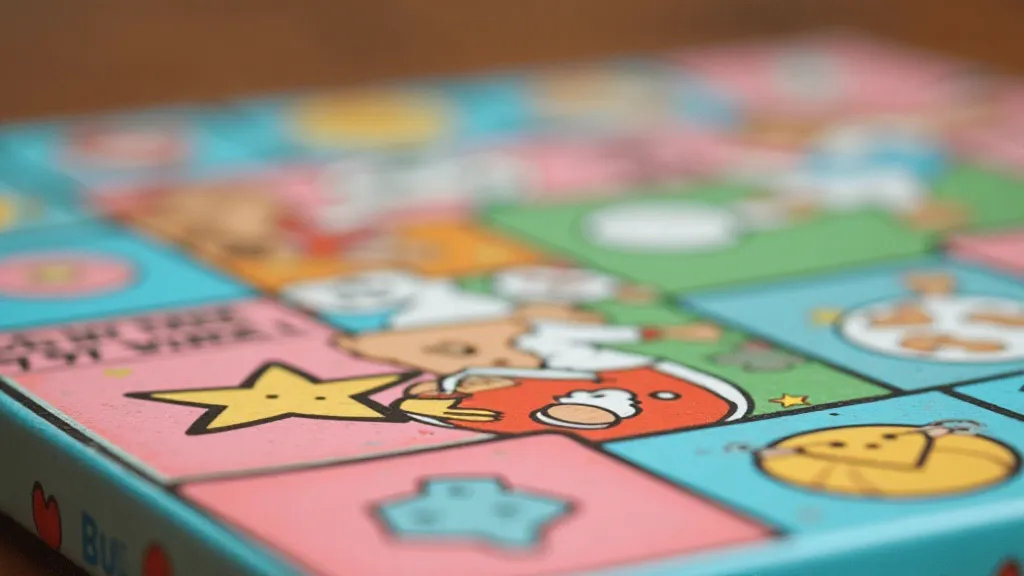
The 1980s brought a significant change once more. The rise of MTV and the aerobics craze ushered in an era of pastels and softer lines. Board game colors reflected this shift. Games for younger audiences, in particular, embraced pinks, blues, lavenders and mint greens. These colors communicated a sense of gentleness, playfulness and innocence. Themes also shifted to reflect these values, with games focusing on friendship, creativity and personal growth.
While the pastel aesthetic might seem saccharine to some modern players, it's crucial to understand the context in which these games were created. They weren’t designed to be challenging or competitive; they were intended to be enjoyable and accessible to a wider audience. The colors contributed directly to this sense of approachability and fun. And, like the earlier examples, they spoke volumes about the prevailing cultural trends. The challenges and subtle nuances in restoring these vintage treasures, to preserve their original character, are covered in detail in a related article exploring the care and attention required for these delicate artifacts. The artists and designers who brought these visions to life often remain unsung heroes, with their contributions largely overlooked. A closer look at the individuals behind these iconic designs reveals a fascinating and often untold story, shedding light on their artistry and influence.
Beyond Aesthetics: The Craftsmanship and Preservation
Collecting and restoring vintage board games isn’t just about acquiring beautiful objects; it's about preserving a piece of cultural history. The quality of the materials used in these games often surpasses what we see today. The thick cardboard boxes, the sturdy game pieces, the vibrant colors – they were all a testament to a time when durability and craftsmanship were highly valued. Many of these games were lithographed, a printing process that allowed for incredibly detailed and vibrant images.
Restoration often involves delicate work—cleaning dust and grime, repairing torn box flaps and even recoloring faded game pieces. However, it's important to approach restoration with respect for the original character of the game. The imperfections and signs of wear are part of its story. A pristine, factory-fresh appearance can often detract from the game's charm and historical significance. The small cracks, the slightly worn edges – these are reminders of the game’s journey through time. It's fascinating to consider how the design lineage of board games has evolved over the years, and how subtle variations in mechanics and aesthetics connect seemingly disparate titles—a topic investigated further in Echoes in the Polyhedral Dice: Tracing Lineage in Tabletop Game Design. The details and effort behind preserving these delicate pieces highlights the often overlooked contributions of the artists who shaped them, and a deeper exploration of their stories and inspirations can be found elsewhere.
A Silent Language: Appreciating the Palette
The color palettes of vintage board games represent more than just aesthetic choices; they’re a reflection of the social, economic and cultural trends that shaped a generation. They’re a silent language, speaking to our memories, our aspirations and our sense of nostalgia. They offer a fascinating glimpse into a time when board games were more than just entertainment; they were a shared experience, a family tradition and a cultural artifact. The individuals behind these iconic designs often remain in the shadows, their contributions overlooked—a situation that underscores the importance of recognizing and celebrating their artistry as explored in The Silent Architects: Uncovering the Untold Stories of Board Game Illustrators. Understanding the subtle impact these artists had on shaping our collective memories and nostalgic feelings offers a richer appreciation for their craft.
So, the next time you stumble upon a forgotten board game, take a moment to appreciate the colors. Consider what they tell you about the game’s origins, its intended audience and the era in which it was created. You might be surprised by what you discover. The echoes of those colors resonate long after the game itself is packed away.